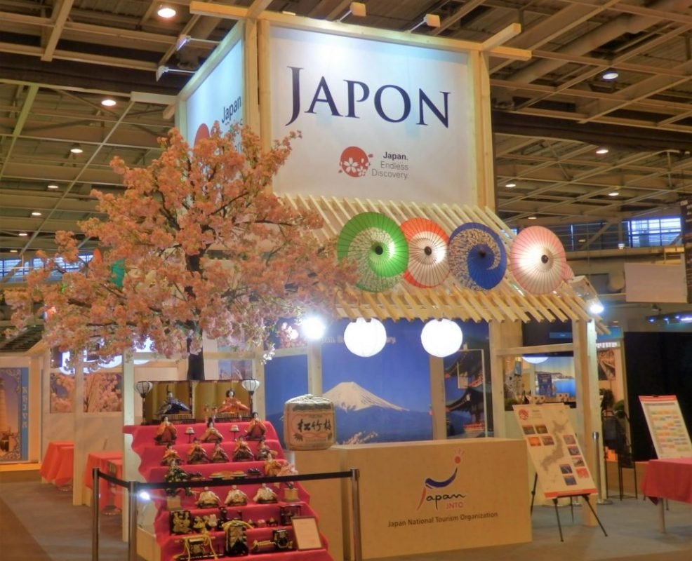
1. Corporate Identity
Thinking about how you present yourself to the general public, potential customers and suppliers is paramount. Successful branding should be simple yet striking and most importantly professional. Look at branding that appeals to you and then think of the reasons of why it appeals. Use this reasoning when creating your own branding.
2. How to layout your design
When creating a design using your branding note there is a hierarchy – this is how the human eye takes in information. The logo should be placed at the top of your design as this is the first thing that will be seen. Human nature naturally goes from left to right and top to bottom so also bear this in mind. A popular design will go (from top to bottom) – logo, image, copy and then contact information.
3. How much is too much?
Remember in many instances less is more so try not to include reams of copy. Exhibitions are busy environments and people simply do not bother to read masses of text. Pop-up-stands and pull-up banners should be used as attractive and informative backdrops with a clear and precise message. Edit your design to clear titles and important bullet points. You only have a matter of seconds to connect with your audience so use it wisely. Make sure there is space between each component of your design so it is easily digestible. If a design is too crowded the natural reaction is to look away as there is too much information to take in.
4. How to use colours & fonts
Look into colours appropriate to your business and then consider fonts. A bold font immediately stands out unlike a lightweight font which can be easily lost. The right combination of font and colour will ensure that your brand has the desired impact. Keep in mind that some fonts do not have the same professional appearence and are better suited to other more informal applications. We recommend Fonts.com as they have a comprehensive range of fonts available for all applications.
5. Let’s talk technical
Be aware of technical issues; a logo should be supplied as a vector graphic as this can be used at any size without loss of quality. Images should be at 300 dpi (at finished size) for best results and should always be supplied in CMYK for printing. The right choice of image will make your design look a thousand times better. Also make sure fonts are “outlined” as this will ensure there are no integrity issues with your type. Each product has its own artwork template with full dimensions, program recommendations and general do’s and don’ts.
6. Ask for advice
Hopefully by following this guide you can create a show stopping design that will connect in the best possible way to your intended audience. If you are unsure about anything please feel free to contact us and one of our professional, in-house designers will be more than happy to help.

